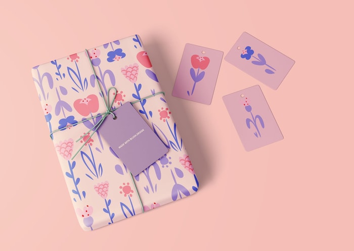
Packaging is an Art: 5 Eye-Catching Ways To Illustrate Your Packages
Blush highlights 5 unique ways of using illustration to make your packaging design stand-out and enhance your brand identity.
By Guest Author — 16 March, 2021
Packaging design is more than just stuffing a product into a cardboard box. On the contrary, good product package design is an art form.
Seriously, just ask any designer! It’s not just the product that makes a difference – it’s the actual package it comes in and its beautiful components that tell the story of a product and brand.
But designing sometimes can feel daunting, so what's the secret sauce to making awesome packages even for non-designers? Pairing your sustainable packages with easy to customize illustrations from Blush, of course!
With the upcoming 2021 packaging design trends in full swing, let's see how working with a giant library of doodles can turn your packages into a delightfully eye-popping experience.
1. A tissuey touch-point that pops
Tissue paper is a time-tested classic when it comes to packaging touchpoints. It's light, an excellent space filler, and comes in tons of different colors. But tissue paper that is both sustainable and featuring your own custom illustrations? That's next-level packaging!
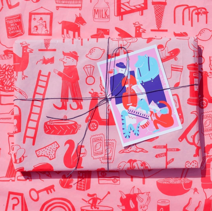
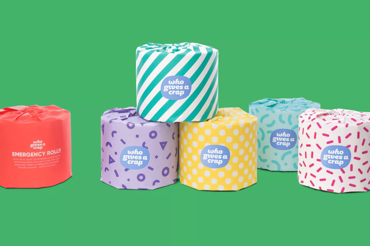
Another splendid thing about tissue paper is that it's easy to work with. With less dimensional criteria to worry about, tissue paper is an excellent option for a balanced and bright all-over pattern.
Make it your own: Bright geometric shapes are going to be a hot item in the 2021 design world, so why not strategically load up your custom tissue paper with some? A colorful combination like this is a great way to add texture, personality, and a nice visual punch.
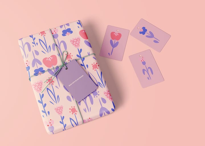
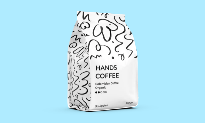
2. Quirky doodles are a delight
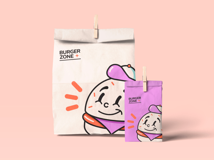
Illustrations are a colorful way to enhance brand identity with personality and flair. That's why companies of all sizes are choosing to include a set of snappy doodles for their package design needs in 2021.
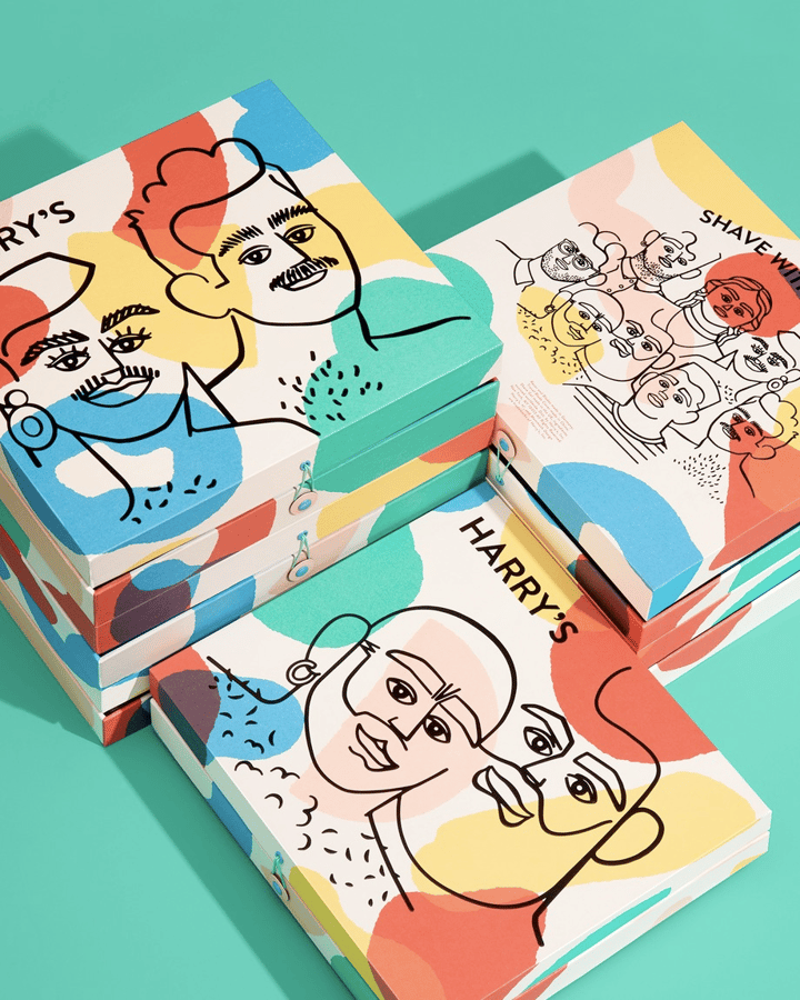
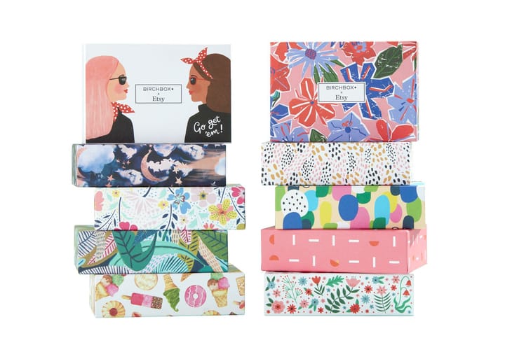
The combination of illustrations and packaging design is also a super-nifty marketing technique. Since all aspects of Blush illustrations are customizable, each component of the package design can be neatly tailored for your brand messaging.
Make it your own: Break away from the stuffy minimal look, and embrace a fresh set of doodle characters that are warm and inviting! You won't be alone in adopting this method as major brands are buying into this trend due to its diverse and inclusive aesthetic.
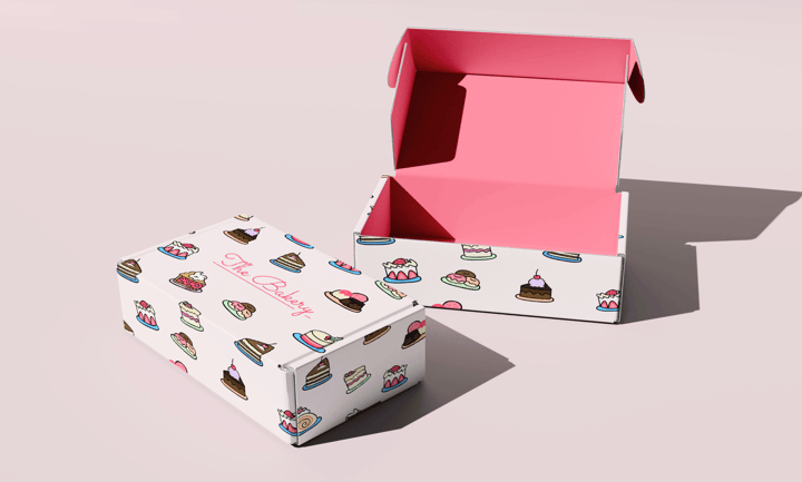
3. Add a little abstract awesomeness
Abstract visuals make for fantastic packaging elements that both excite and intrigue. Abstractions are also an excellent way to fill up a composition for all types of packaging, be it compostable mailer, wrapping paper, or box.
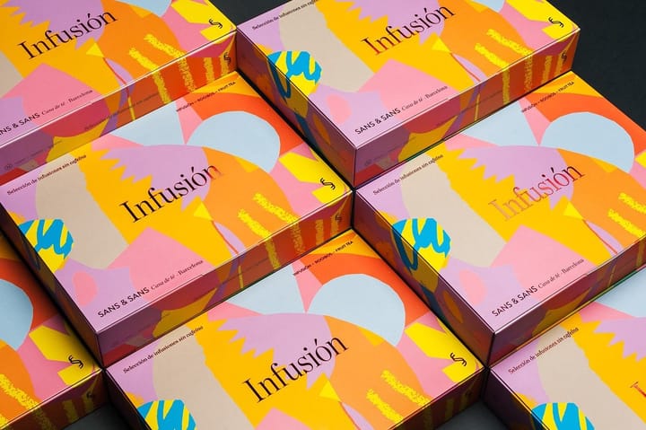
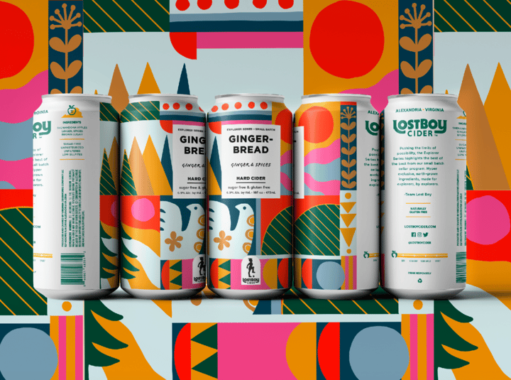
Also, the simple truth is that abstractions are cool, edgy, and convey dynamic energy. Packages featuring this design trend are a great way to visually stimulate customers before they even start enjoying the product.
Make it your own: Abstractions are a great way to let your creativity walk on the wild side. That doesn't necessarily mean to throw all design principles out the window, but instead that you can explore shapes and colors a bit more freely. Get weird with it!
4. Typography favors the bold
Slight and simple fonts work for some, but visually striking typography will have the spotlight this year. This goes double for packaging design! With online shopping at an all-time high, gracing your package design with bold and loud lettering is a great way to separate your brand from the millions of vanilla cardboard boxes, white envelopes, and bland mailers.
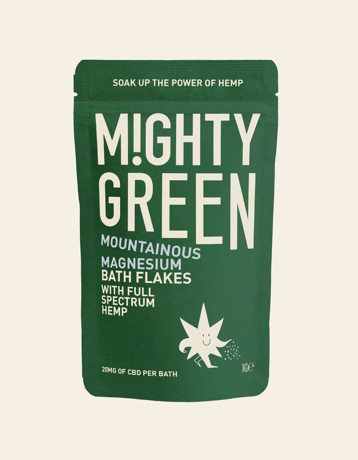
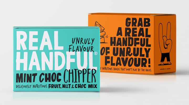
Also, bold typography is just so dang fun! Recent years have shown the design world that there are vast and ultra-inventive ways to use lettering within the design.
Make it your own: Nearly all good examples of package design use scale and sizing effectively, which means that this could be the perfect year to go BIG on the typography elements. Let the customer see that wonderful brand name!
5. Groovy design is back, baby!
If you've been missing the psychedelic vibes of festivals and concerts, you're in for a treat, because the groovy aesthetic is coming in hot for 2021.
Why? Firstly, trippy design creates a sense of allure and intrigue, leaving customers even more eager to open up the goods.
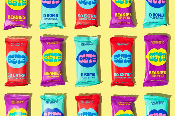
Secondly, illustrations are the ideal creative components to make these mind-bending designs. Psychedelia, sustainable packages, and customizable doodles truly offer the ultimate opportunity to experiment with your transcendent concepts.
Make it your own: Liven up your color palette for this style, and match it with conscious-expanding shapes and patterns. Do your best to apply symmetry with this design trend, as to not let your far-out illustrations get too wild and wacky.
Start Elevating Your Package Design with Illustrations
It's a brave new design world this year, and the number of exciting possibilities to create stunning and original packaging are endless. The best part is that now, with the awesome packaging options from Noissue, combined with Blush's huge library of customizable illustrations, literally everyone can make stunning packages in no time at all.
Get those creative muscles pumping and start illustrating some of your own awesomeness for your packages today!
CTA: Jay Perlman is a copywriter at Blush. Looking for illustrations to create beautiful, attention-grabbing graphics faster than ever? With Blush, you can express your creativity and make wonderful designs within minutes. Learn more about Blush here, and enjoy 20% off our Blush Pro monthly and annual plans with the code NOISSUE2021