
How seven clever creatives are ditching digital to get seen in print
Our partners at Newspaper Club explain how clever creatives have discovered a way to cut through the digital noise and get their work seen. The secret weapon? Print.
By Guest Author — 20 September, 2020
When you’re fighting for space in non-stop social feeds and overflowing inboxes, getting your work seen online these days can feel impossible. Projects that have taken hours, days or even weeks get passed over with the flick of a thumb.
But there is some good news. More and more creatives have discovered a way to cut through the digital noise and get their work seen by those who matter most. Their secret weapon? Print.
At Newspaper Club, we help people get their work into the right hands with their very own newspapers. Newspapers that stop thumbs scrolling and leave a real impression. From eye-catching catalogues to large-format holiday cards (yes, it’s almost that time again), newsprint is an affordable, effective way to tell your story and get heard.
noissue asked us to share some of the most inspiring newspapers our customers have printed this year. From food photographers to typographers, these seven creatives show you how to make a newspaper everyone wants to get their hands on.

The snail mail showcase
With so much day-to-day clicking and scrolling, graphic designer Nick Bamptom prefers to share his work in a format with “more permanence than a vacuous social media post.” When the pandemic put his in-person meetings on hold, he decided to promote his design services through a tabloid newspaper.
His portfolio showcases recent work for a brewery, kombucha brand, festival and coffee roaster. Nick says clients have been “delighted” to receive the newspaper and it’s even launched an “ad-hoc postal social network” with his clients sending back hand-written responses!
Nick’s advice: “Don't hide your personality. Use the uniqueness and feel of the newspaper to invite the reader into your world, strangeness and humour included.”
The tactile taster
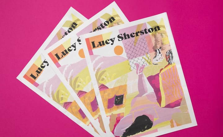
When you’re starting out in the creative industry, sharing your work can feel daunting. “I always told myself I wasn't 'ready' to approach people,” says British illustrator Lucy Sherston about making a portfolio. “But it felt important to just put the work out there.”
Lucy decided to send a “taster portfolio” of her work for Quartz, Herman Miller and Etsy to a small list of people she hoped to work with. She says using a newspaper “ticked all the boxes” — it’s friendly, cost-effective and quick to produce.
Lucy says clients she sent the newspaper to started following her on Instagram and the portfolio even landed her “one really good job from a client I'd wanted to work with.”
Lucy’s advice: “Be selective and don't feel like you have to show everything. Consider who you're sending it to and whether you're really showcasing the type of work you want to be hired for.”
The sell-out style guide
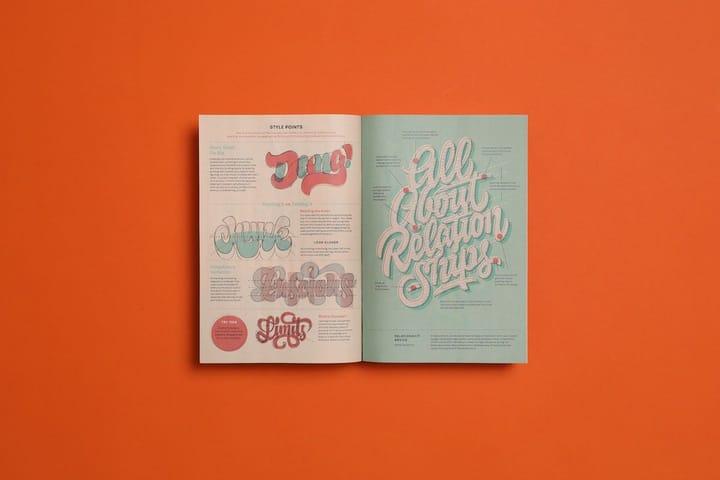
Typographer Mark Caneso has created fonts for Adobe and worked with brands like Adidas, Google and Away. He shares some of the secrets to his lettering success in this 16-page “style guide” newspaper, featuring drawing exercises and insights to help aspiring typographers “draw bigger and bolder and more beautiful letterforms.”
“The response has been overwhelmingly positive,” says Mark. "I sold out of the first round of newspapers very quickly and have reprinted a couple of times. Seeing and hearing from people that they love the design, writing and content makes the project feel even more successful.”
Mark’s advice: “Consider the pacing of your portfolio so that it will tell a story. How one piece leads to the next and how the design and format relate to your work are key.”
The portable portfolio
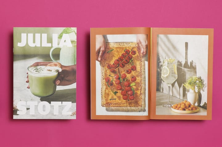
With much of her work being shown online, designing for print is a process that food photographer Julia Stotz treasures. “It’s really special to have a tangible portfolio," she says.
Julia curated the photographs in this portfolio to focus on the kind of work she’d like to do more of in the future, using experimental techniques and original creative processes. "Sharing personal projects really drives future shoots,” she says. "A client or agency will see them and want to create photos with a similar feel."
With a mini newspaper, it’s easy for Julia to keep portfolios handy when she’s on the go: "I love how light and easy they are to keep in my bag and hand out," says Julia.
Julia’s advice: “Consider your audience and your artistic voice when making a portfolio. For this portfolio, I wanted to get straight to the point and immerse the viewer in a world of still-life wonder.”
The just-for-fun experiments
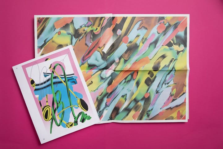
Sometimes you make a newspaper just for fun. For graphic designer Braulio Amado — who’s collaborated with artists including Robyn, Frank Ocean and Beck — newsprint provides a flexible canvas for his “visual experiments.”
In March, Braulio discovered an old hard drive with posters he’d made in 2015 — he collected them in a newspaper and got a great response. Since then, he’s made 6 more newspapers to share his abstract digital illustrations in print. “People love it!” he says.
Braulio’s advice: “Make sure people can tell you had fun doing the work.”

The meaningful manifesto
After reading Larry Neal’s 1968 essay “The Black Arts Movement,” designer Marshall L. Shorts was inspired to create The Black Creatives’ Manifesto in 2017. He recently printed it as a tabloid newspaper in honor of Juneteenth.
The manifesto aims to “inspire and affirm Black Creatives and our collective contributions to the world,” Marshall explains. The newspaper folds out into a poster listing "the principles that I believe every Black Creative from the street to the academy can be inspired by."
“People love the idea of a newspaper and I’ve gotten tons of requests for copies after posting it on Instagram,” says Marshall. “It engages in a different want than we’re accustomed to in the age of digital."
Marshall’s advice: “Set your intention first, follow that up with content and then design aesthetically toward that intention. Use your creativity to not only design something aesthetically pleasing, but also create an enjoyable experience that makes people want to keep the piece.”
The playful posters
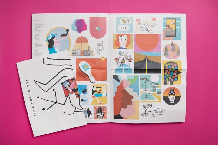
Rob Wilson is an award-winning illustrator and designer working with clients like Design Within Reach, HarperCollins and the Wall Street Journal. His playful, hand-drawn style is perfectly suited to newsprint, which he uses to share his work with art directors.
His most recent portfolio folds out into a double-sided poster, showcasing the “diversity and breadth" of his recent creative projects. “The broadsheet is great for showing work at a large scale,” Rob says. “It gives me the freedom to design in an easy-to-manage format. I know the colors will be bright and I can print as many newspapers as I need — and order more if necessary (which, in this case, I did).”
Rob’s advice: “Take advantage of the scale and format. Design your presentation in a way that allows the newspaper format to show it off.”
Want to see how you can make an impression with your own newspaper? Order free Newspaper Club samples and get inspired to print!
Sarah Belfort is the Brand Manager at Newspaper Club, a print-on-demand service making it easier for everyone to print their own newspapers. There's no minimum order, easy online ordering and fast worldwide shipping. Discover what you can make on their website!