
A Deep Dive on South Coast Swimwear with Evita Creative!
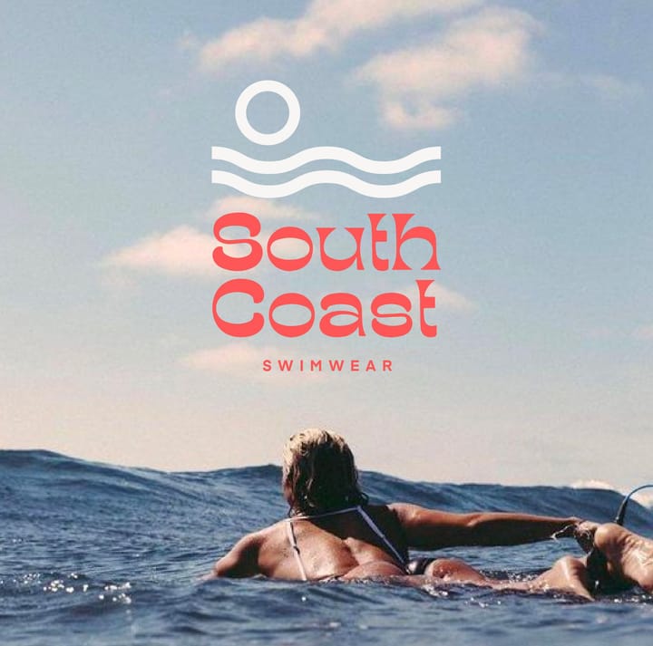
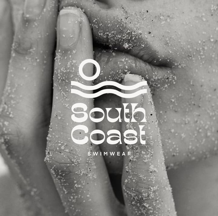
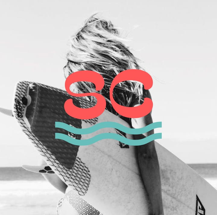
“I went for a retro, summer ocean palette with an organic, serif, vintage-style typeface to create a relaxed and summery feeling. I also added a minimalistic water and sun brandmark.” – Evita
By noissue — 17 December, 2021
Launching one of our newest series on the Wrap, we’ll be showcasing some remarkable noissue Creatives and their noteworthy passion projects. Deep diving into the process and magic of personal design work, we look to our Creatives to share what sparks their inspiration. For this feature, we'll be highlighting the story behind South Coast, a swimwear brand created by Evita Creative.
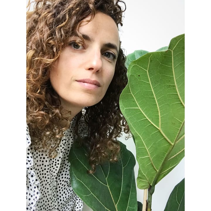
Evita Witzenhausen, founder of Evita Creative, was born and raised in Amsterdam and began exploring her love for design at a young age. She has 15+ years of experience working with a broad range of companies and clients, and has developed a refined aesthetic along the way. Working with Evita ensures you'll get a designer with a big picture mindset, who loves to create brands that thrive.
Evita specializes in branding design and helps businesses attract dream customers with purposeful branding. She has collaborated with many upcoming beauty, fashion and lifestyle brands that are owned and powered by driven small businesses and entrepreneurs. Her work mainly features minimalistic, strong and typographic styles of design.
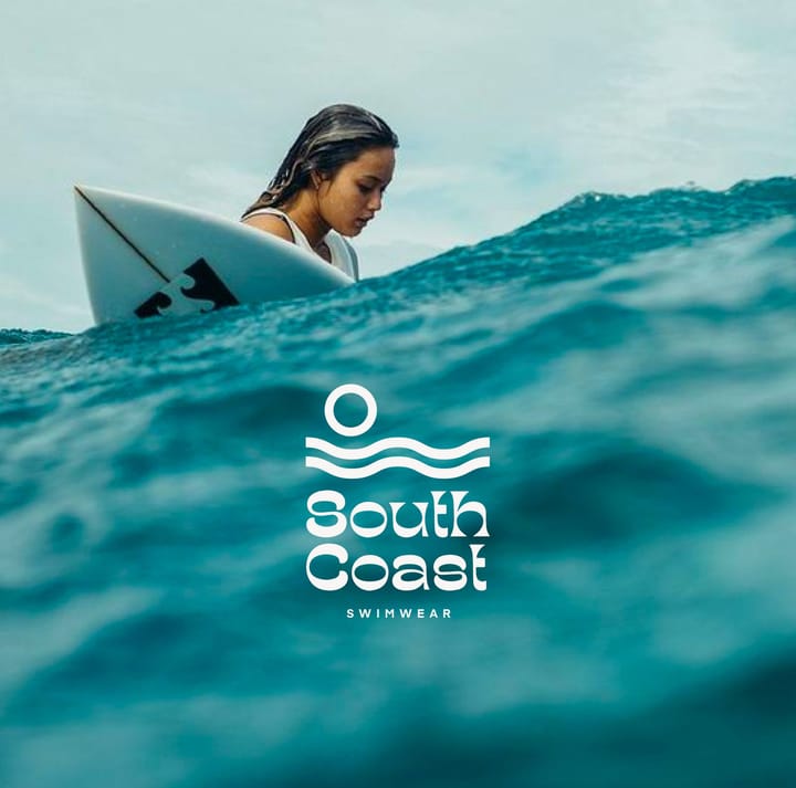
South Coast is one of Evita’s many passion projects that she has worked on. It is a swimwear brand for surfers that love comfortable and cool-looking gear. Evita ideated this chic brand and wanted to encapsulate it with clean, retro designs to reflect the chill beach vibe for fellow ocean lovers.
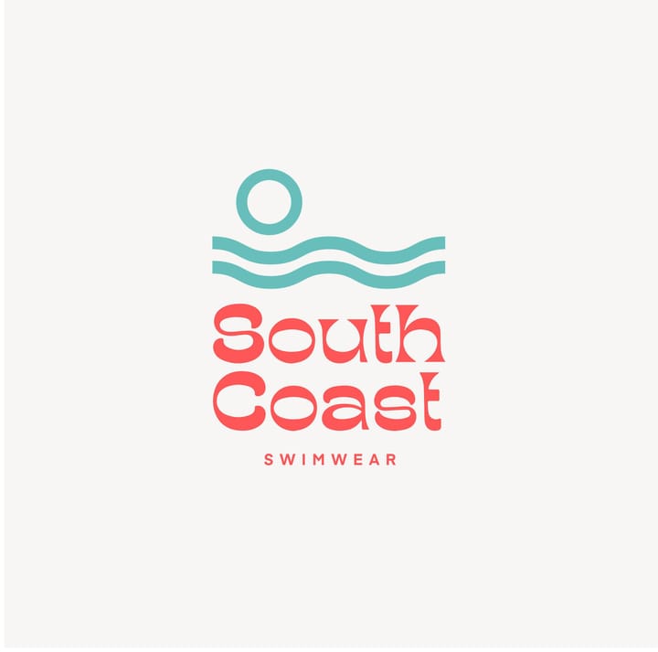
Evita had put together a moodboard to get a more distinct feel of the branding for South Coast and to plan out the overall brand identity she was going for. Planning out a moodboard really helps in building ideas and ensuring that everything flows together.
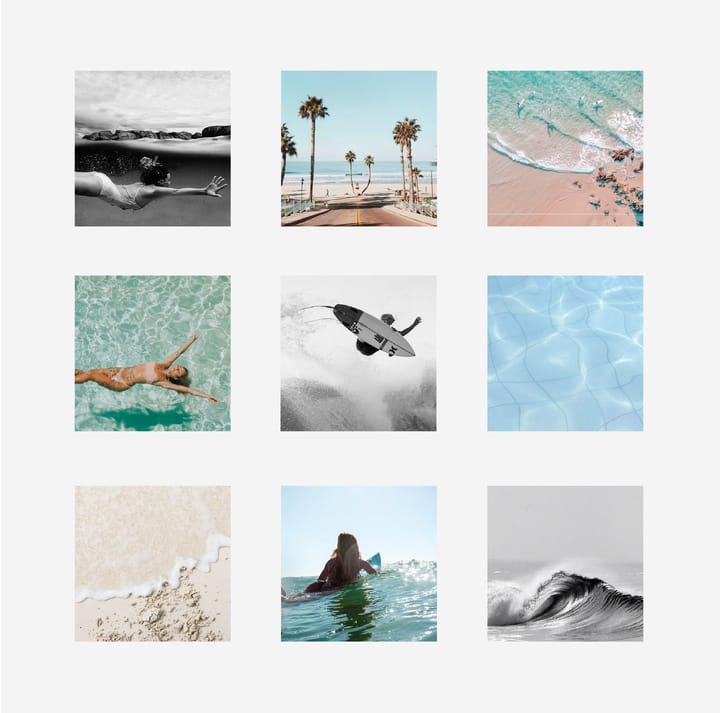
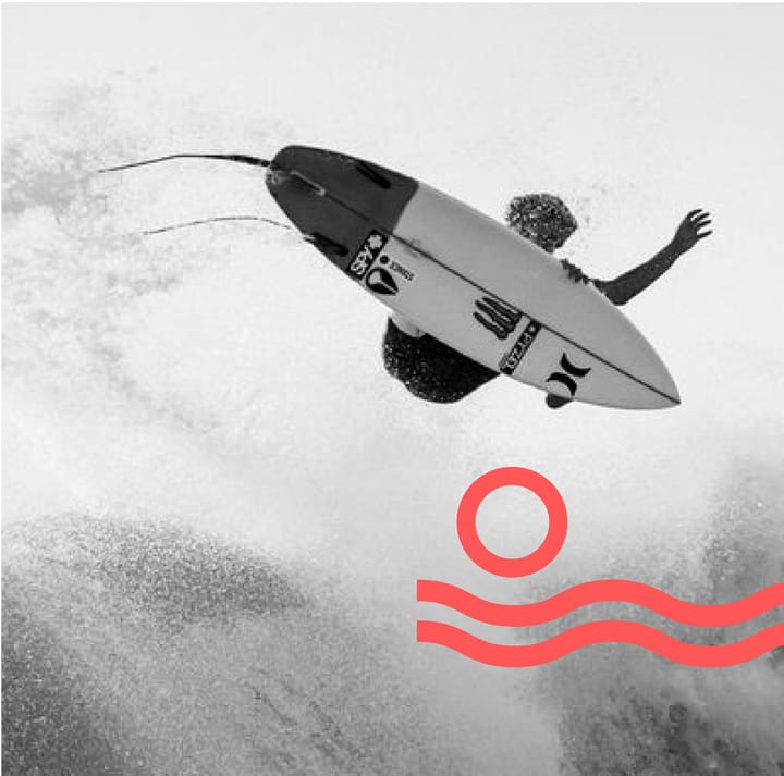
“I went for a retro, summer ocean palette with an organic, serif, vintage-style typeface to create a relaxed and summery feeling. I also added a minimalistic water and sun brandmark.” – Evita
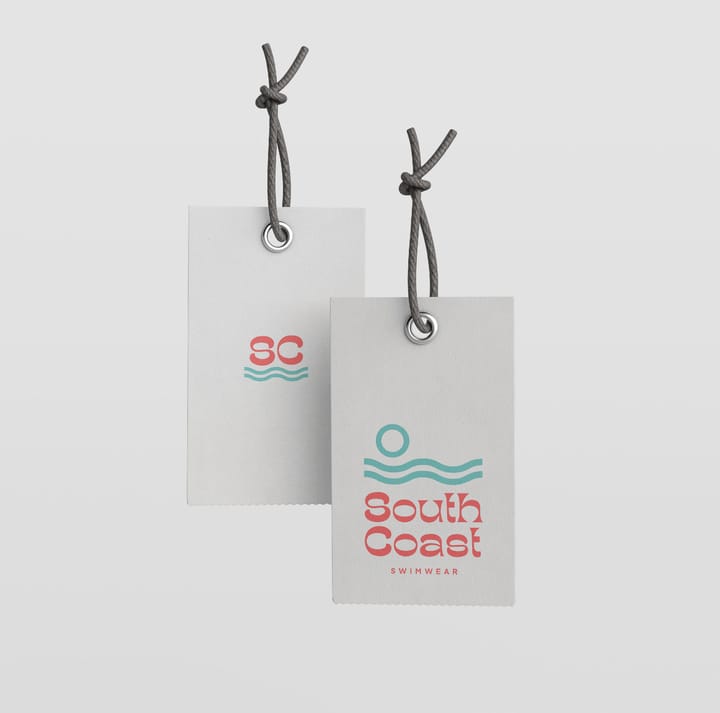
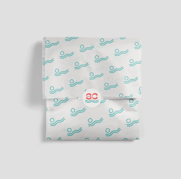
Evita had come across noissue through fellow creatives that she engages with online. She had also made use of the noissue packaging mockups to tie everything together.
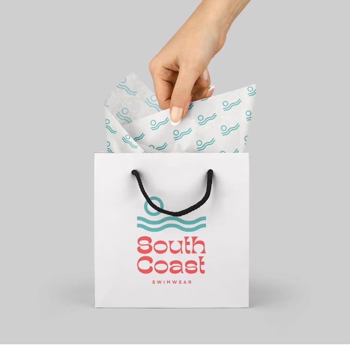
Evita shares: “I follow a lot of talented designers and saw a lot of work created with noissue. This is where I started following noissue. I get a lot of inspiration from everything that is created with noissue and it also gives me a lot of freedom as a designer.”
Find out more about Evita Creative here:
Creative Profile: https://noissue.co/community/creative/partner/evita-creative
Website: https://www.evitawitzenhausen.com/
Instagram: @evita.creative